One year ago I wrote this where I used the 1000 most popular baby names each year to find spikes in name popularity. Inspired by this here (or maybe by stealing her idea), I connected these spikes to real or fictional characters in history.
Somehow I missed that the social security administration allows researchers to download more complete data, data which includes ALL names (almost – there must be at least 5 people given the name). Further, it’s conveniently accessible here, so let’s do more investigation. Rather than pull out names with extreme properties as before, let’s try to predict changes in a subset of names. There were some spikes in popularity for a couple presidential names in our last look (specifically for Woodrow and Grover), so do these spikes occur with most presidents’ names? If so, can we predict how big the swing in popularity will be? Turns out, yes and yes.
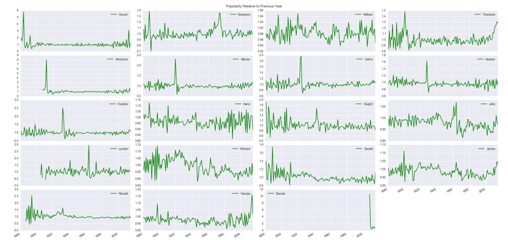
We will essentially perform a least squares regression (see this for a some technical stuff concerning stats language vs linear algebra), but before we get to modeling “presidential popularity,” let’s take a cursory look at the data. I have the first names and the number of babies given those names each year from 1880 to 2015 (for security reasons, there had to have been at lease 5 babies with that name). As the total number of babies born each year varies, we normalize by taking the percentages of babies born with a particular name each year. Not surprisingly the variety of names has changed drastically over time. There were about 1,000 unique names given in 1880 compared with about 14,000 in 2015. With the number of unique names trending upward, the percentage of babies born with historically traditional names has generally decreased.


The clear downward trends on the right are your “Williams,” “Georges,” “Richards” – the more common names. Still, there are clearly years where these names reverse their general trends. As our goal will be to predict the popularity of a presidential name in an election year or slightly post election year, maybe this is the value we should predict – the percentages of babies born with the presidential candidate’s name. There is a problem with scale. For example, “Barack” had a huge spike in popularity during and after his campaign, but the percentage was orders of magnitude smaller than most other names (at its highest less than 0.0004 compared to a name like “William” which is around 0.01 at its least popular level). The trends of big names would dominate, and the model would essentially say “do what the most common names do.” Further, these common names tend not to vary much from their general long-term trends, so we need to find some other measure to predict. Instead of the percentage of babies born, we will use relative risk. For a given name, say 


While relative popularity is probably our best option, it does accentuate less common names (it doesn’t take much change to make this value large when your denominator is tiny). For the heck of it, now that I had a bigger data set, I wanted to see what name had the largest relative popularity from the full set. This was “Omarion,” (popularity due to debut of R&B singer Omari Ishmael Grandberry in B2K) whose relative popularity jumped as high 83, but this represents a jump from the minuscule 0.000003 in 2001 to the still very tiny 0.000249 in 2002. All this means to me is that our model should include the current popularity of a name (percentage of babies born with that name) as a predictor. By the way, even though we will be predicting relative popularity which is calculated based on these percentages, and we will also be using name percentages as a predictor, this is not cheating. The model will only see percentages prior to those used in calculating relative popularity. I’ll explain the model more fully below.
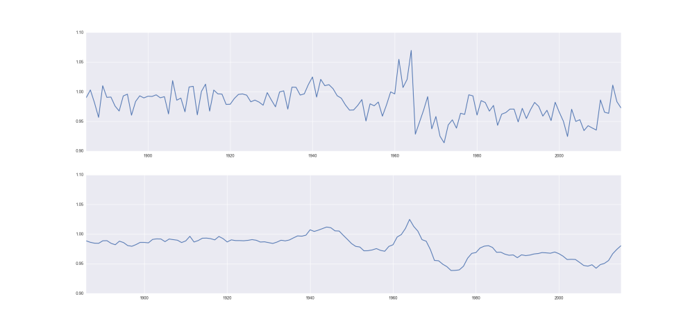
Another reasonable predictor would be previous relative popularity (if a name was already gaining or losing popularity, that trend may continue). You will notice that there is quite a bit of noise/variability in relative popularity, so I will smooth the data. Specifically, for each year, I’ll average this value with the previous 4 years. I’ll do the same for the name percentages data. This is common in signal processing.
So let’s do a simple ordinary least squares regression with just these two predictors. We will fit 
is the name’s popularity (percentage of babies given the president’s name) from the year before the election year (smoothed)
is the relative popularity for the president’s name from the year before the election year (also smoothed)
Note we are predicting the spike in relative popularity without using any “future data” meaning we are using only data before the election year. Turns out, this is not a great model. It seems reasonable that once a name achieves a certain level of commonality, continuing to increase its popularity may not matter much. So instead of a linear relationship with 

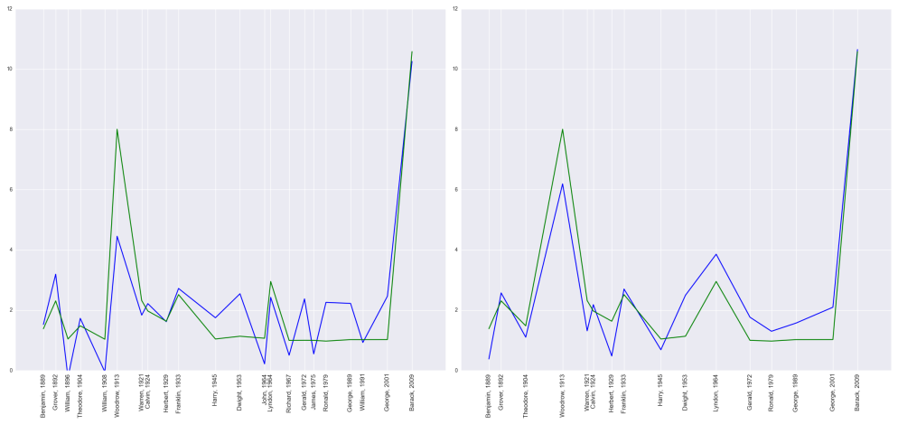
Not bad, but there are still some issues to overcome. When we examine the error vs. predicted values, many of these points lie along a straight line meaning for many presidents, the error is proportional to the predicted value. The model is useless for these presidents; this corresponds to the names in the figure above whose value is near 


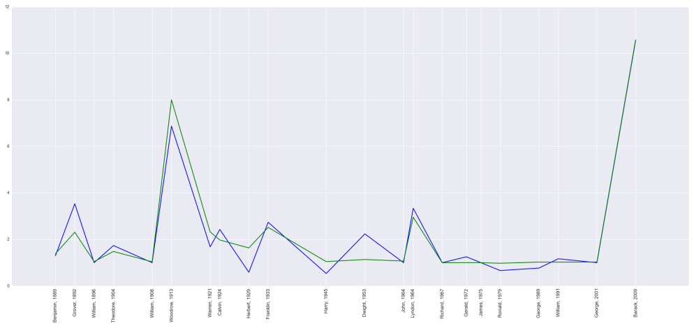
Notice the predicted values tend to estimate too low for early presidents and too high for later presidents. This indicates there is a time factor that needs to be considered. Maybe the names of more recent presidents don’t have as much influence on baby names as in the past. The easiest way to account for this is to add time as a predictor. My final model sets 


is the index of the name to account for the time component of the series.
This obviously isn’t a linear model since we’ve instituted a switch that sets our predicted value as 

Two questions remain. Do the parameter estimates make sense, and is the model useful for predictions? There does not appear to be an issue with multicollinearity, so we should be able to interpret our model parameter estimates. We have 


Finally, to get some idea of how well this will work for prediction, I’ll perform a type of cross-validation. Since I have such a small set of data, I fit the same least squares model multiple times, each time leaving out just a single name. I used the resulting model to predict the left out data point and calculated the error. Doing this for each removed data point and summing the squared error, I can compute the length of a kind of overall error vector. I can compare this to the length of 

By the way, the model predicts “Donald” will be 


